MS Canada Brand Refresh
With a bold new vision to create a world free of multiple sclerosis (MS), MS Canada embarked on a full rebrand to match. Our team’s challenge was to incorporate the non-profit’s new voice, logo, and design principles into long-standing and high-performing campaigns. Over several years, our team helped pave the way to authentic and fresh creative that represented the many lived experiences of those in the MS community.
Client
MS Canada
Year
2023-2024
The Identity
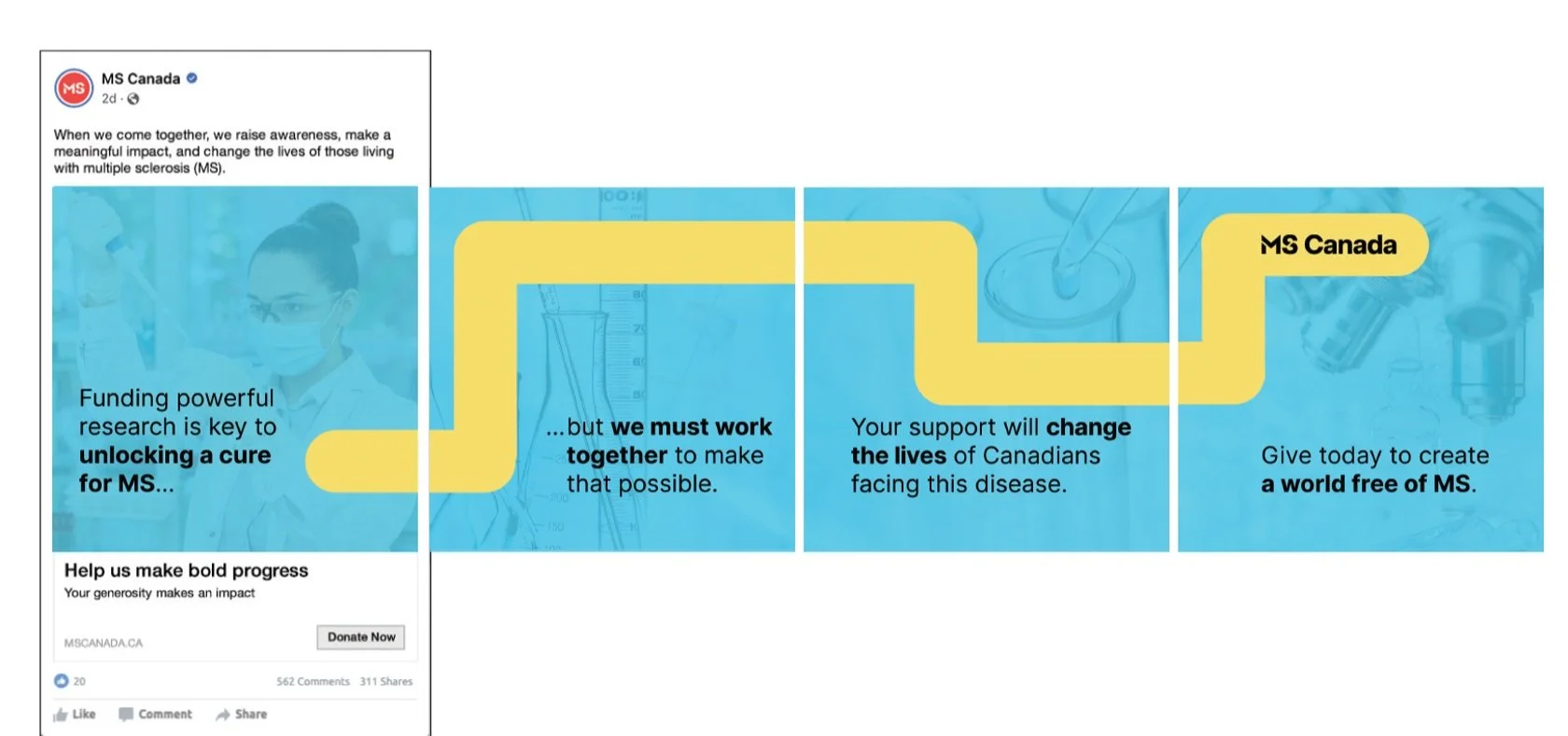
A key piece of the new MS Canada brand is the series of rounded, visual shapes we call “the connector” — you can see them used above in a series of social media ads.
Through the use of “the connector”, we see vibrancy, color and movement in shapes that can be fluid and linear, graphic and energetic. However these shapes appear, they convey a sense of focus, progress, and momentum.
They communicate that MS Canada is a brand that understands how much it means to people to be able to experience the full spectrum of connections — including neural connections threatened by the disease, and the powerful unifying force of those living with it.
Imagery & Illustration
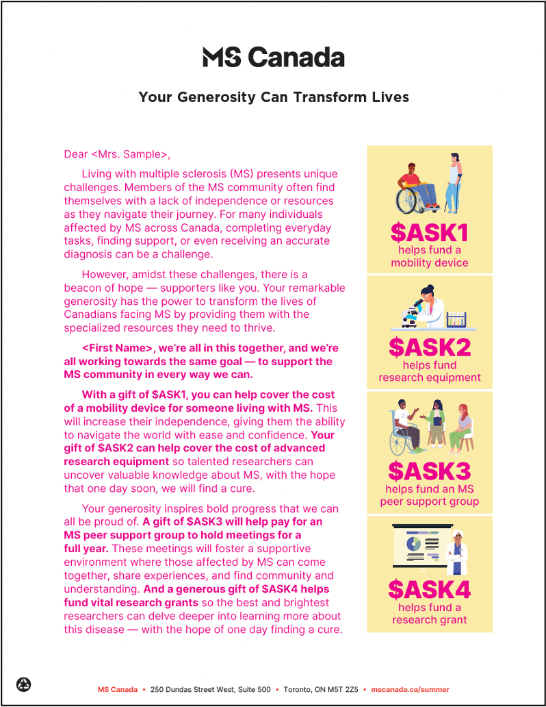
To help showcase the fact that people of all races, ages, and disability levels are living with multiple sclerosis, our team utilized both imagery and illustration in our campaigns. The result is a set of creative that feels cohesive yet diverse — much like the MS community itself.
Pink text indicates personalization / variable copy processing


